Editing and Placements
Part of Editing UGC for different placements
Designing captions that remain readable on a phone
Design UGC captions for a phone by checking accuracy, timing, contrast, product visibility and placement controls in the final export.
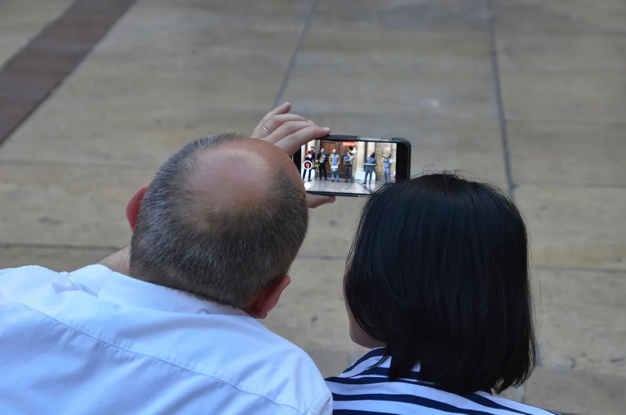
Make captions readable at the size and speed of the finished phone video. Transcribe speech and meaningful audio accurately, break text at natural phrases, leave time to read it and keep it clear of the product and platform controls. Review the exported version on a phone; a large editing monitor can conceal small-text problems.
Watch the export on a phone at the size it will be viewed, not just on the editing monitor. If words are hard to read against the footage, adjust their size, contrast, backing or position, then export and check again.
Separate captions from promotional text
Captions convey speech and meaningful non-speech audio, including who is speaking and meaningful sound effects. A slogan, product label or call to action is a different text element, so avoid stacking several messages on one frame. If essential information appears only in the picture, consider whether the audio or another accessible format also needs to explain it.
Start with the recording; automated transcription can provide a draft, but check it against the audio. Check names, product terms and numbers against the recording and approved material, and identify speakers and meaningful sound effects. Keep the creator’s meaning intact, and avoid or explain jargon, acronyms and idioms rather than turning a sentence into a stronger claim.
Give each phrase room
Break captions at sensible pauses rather than an arbitrary character count. On the phone, check that each phrase remains on screen long enough to read; if not, adjust the timing or remove non-essential wording while preserving meaning. Keep captions aligned with the speech and action; a result caption shown before the result may change the impression.
Use a clear font, sufficient size and strong contrast. Moving footage can make text hard to see as the background changes, so check any backing or outline across the whole sequence and review it on the phone. W3C’s WCAG contrast criterion calls for at least 4.5:1 for text, or 3:1 for large-scale text.
For the WCAG contrast rule, large-scale text means at least 18 point, or 14 point bold. This definition sets the lower contrast threshold for large text; it is not a phone-specific caption-size recommendation. A contrast check alone does not establish that timed captions are readable on a phone.
WCAG Contrast Requirements for Captions
- Minimum Contrast Ratio (Normal Text)4.5:1
- Minimum Contrast Ratio (Large Text)3:1
- Large Text DefinitionAt least 18 point, or 14 point bold
- Note on Phone ReadabilityContrast check alone does not guarantee readability on mobile devices
Steps to Ensure Captions Are Accessible on Mobile
- Transcribe speech and meaningful non-speech audio accuratelyUse recording as reference; verify names, numbers, product terms
- Break captions at natural pauses, not character limitsEnsure phrases are readable in context and timing
- Apply sufficient contrast (4.5:1 for normal text)Use backing or outline if needed; test across dynamic footage
- Position captions away from key product details and controlsUse TikTok’s In-Feed-Standard Version LTR .zip for Australian ads
- Export and review on actual device before publishingDo not rely solely on platform preview or editing monitor
Keep text out of the action and interface
Place captions away from the detail a buyer needs to inspect. TikTok’s auction in-feed safe-zone size depends on the video dimensions, ad-caption length and additional formats, so use the matching downloadable guide rather than a fixed template. The guide files are named In-Feed-Standard Version LTR .zip and In-Feed with Anchor-Standard LTR .zip.
For Australian placements, use In-Feed-Standard Version LTR .zip, the standard file for all regions except the Arabic region. If the ad uses anchors, use In-Feed with Anchor-Standard LTR .zip.
TikTok Spark Ads pull ad captions directly from the organic video captions, with a maximum of four displayed lines including emojis. Non-Spark Ads display ad captions in white in a uniform font that cannot be customised. These platform rules affect how text appears in the ad, so review the relevant version before publishing.
For TikTok Non-Spark Ads, vertical 9:16 is recommended at 540 × 960 px or larger; accepted video formats are .mp4, .mov, .mpeg, .3gp and .avi. Spark Ads accept .mp4 or .mov. TikTok notes that the preview is not device-specific and may differ slightly from the live version.
Captions may be closed, so viewers can hide or show them, or open, so they remain displayed. If the destination supports a separate caption track, check the player’s controls and rendering; burned-in captions stay visible and may need a different position in each export.
Watch the final version with sound off and on, checking wording, timing, product visibility and qualifications together. Check it on a phone as well as in the platform preview, then record which caption file or export was reviewed.
TikTok Ad Caption Display: Spark vs Non-Spark Ads
- Caption Source
- TikTok Spark Ads: Pull from organic video captions
- Max Lines Displayed
- 4 lines (including emojis)
- Font Customisation
- Not allowed – uniform white font
- Recommended Format
- .mp4 or .mov
- Non-Spark Ads: Caption Source
- Directly from ad caption field
- Non-Spark Ads: Max Lines
- Unspecified, but limited by space and platform rendering
- Non-Spark Ads: Font Customisation
- No – uniform white font
- Non-Spark Ads: Recommended Size
- 540 × 960 px or larger (vertical 9:16)